Everything Trading
Members Dashboard
Project type
B2C Web Platform (E-learning / Trading Education)
My role
UI / UX Designer
Tools
Figma • Design System • Prototyping
Contribution
User research, UX strategy, information architecture, dashboard design, and prototyping
Project overview
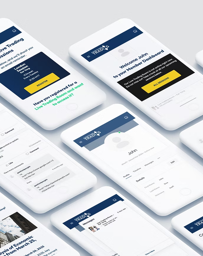
Everything Trading is an online learning platform focused on helping users develop trading skills through structured courses and community interaction.
The goal of this project was to redesign the logged-in user dashboard to create a more intuitive, structured, and engaging experience that supports learning progression and user retention.
The Problem
The existing dashboard suffered from poor usability and lacked a clear structure.
Users struggled to:
- Navigate between courses and content
- Track their learning progress
- Access important updates and community features
This resulted in high bounce rates, increased support requests, and a fragmented user experience.
Target users:
- Beginner traders looking for structured learning paths
- Advanced users tracking progress and certifications
- Community members engaging with discussions and shared content
Solution
To address the usability challenges, I designed a streamlined dashboard experience centered around clarity, accessibility, and user progression.
The solution focused on:
- Simplifying navigation and reducing cognitive load
- Structuring content around key user goals
- Creating a modular and scalable dashboard layout
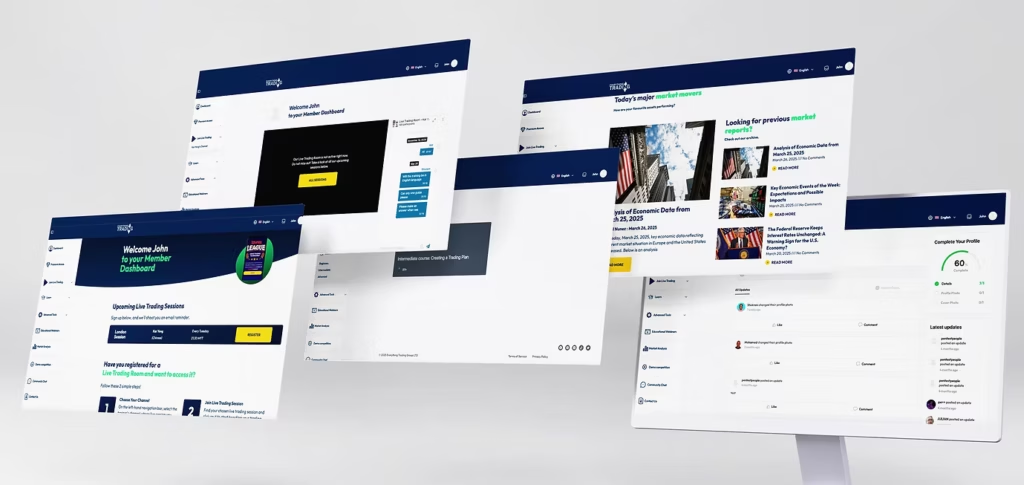
A clean, card-based interface was introduced to organize information into clear, actionable sections, allowing users to quickly understand their next steps.
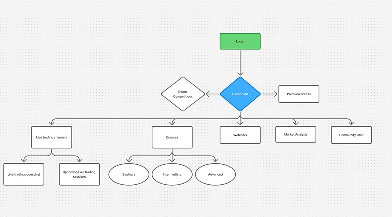
USER FLOWS & STRUCTURE
The dashboard was organized into core areas based on user needs:
- My Courses – quick access to active learning content
- Progress Tracking – visual indicators of course completion
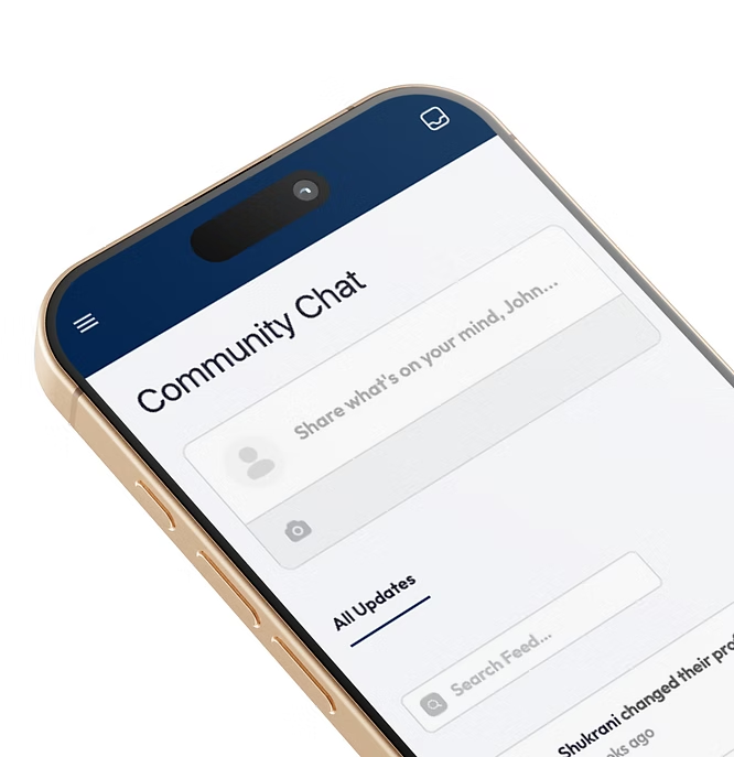
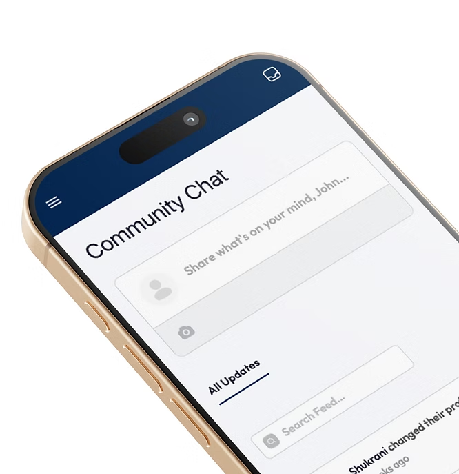
- Community – engagement with other users
- Announcements – updates and important information
This structure ensured that users could move seamlessly between learning, tracking, and interaction.
WIREFRAMES & PROTOTYPING
Low-fidelity wireframes were created to explore layout structure and prioritize content hierarchy.
The focus was on:
- Reducing unnecessary steps
- Highlighting key actions
- Ensuring a clear visual flow across the dashboard
These were then translated into high-fidelity designs and interactive prototypes in Figma, allowing for iterative feedback and refinement.

UI DESIGN
The interface was designed with a modern and minimal approach to improve usability and visual clarity.
Key design decisions included:
- Card-based layout for modular content organization
- Clear call-to-action elements to guide user behavior
- Balanced use of spacing and typography for readability
- Optional light/dark mode to support accessibility and user preference